

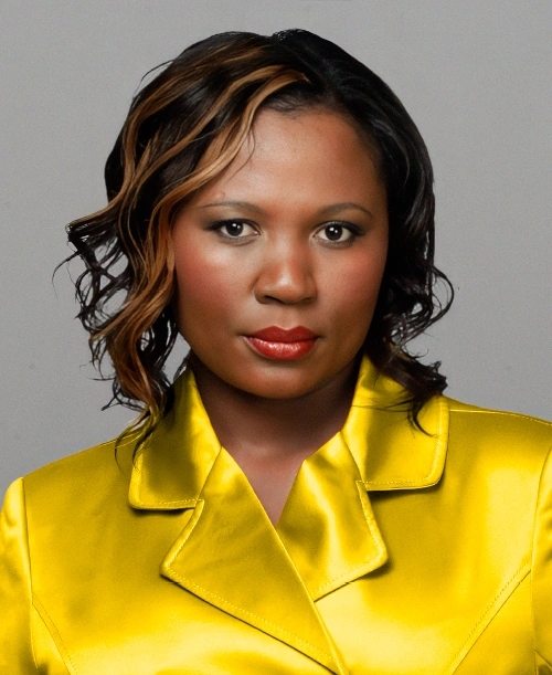

RUTH, 34: EXECUTIVE SECRETARY
Rich Skin ToneThe difference between the incorrect and correct clothing colour is quite remarkable. In the before photograph, the bright yellow disconnects with Ruth’s natural colouring. In the after photograph, the rich butternut harmonises beautifully with her skin tone, creating a warmer, more balanced and radiant appearance. It is interesting to note that Ruth’s hair and makeup are exactly the same in both photographs. The significant difference is the colour she is wearing. That’s why choosing the correct colours is so important. Your personalised Chata Romano Colour Chart will guide you to the shades that naturally enhance your complexion, helping you look absolutely FABulous!
Testimonial
“I have always worn very bright colours and I can, finally, see the difference. Most importantly, I now understand why certain colours work, and others don’t. I love, love, LOVE my digital colour chart – my best friend in my handbag!”
Makeover by: Chata Romano
Hairdresser Hashim Neema
Makeup Artist Bianca Bryne using products by Clarins, Mac and Makeup Forever
Clothing from Truworths
Photography Francois Booyens

PAMELA, 35: AU PAIR
Rich Skin Tone
Pamela is a natural beauty. She looked lovely in the before photograph, but with a few carefully considered…
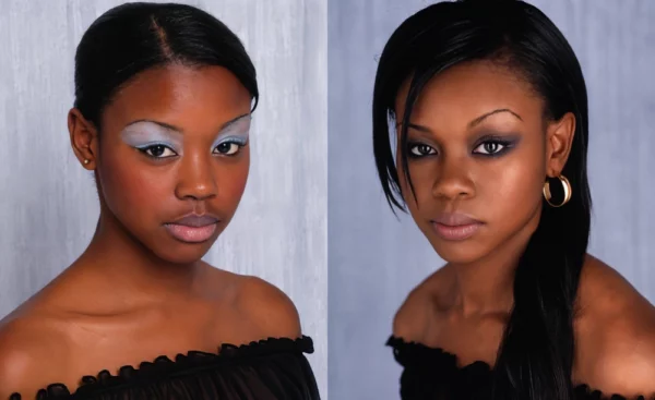
YOLANDA, 21: STUDENT
I was casting for makeovers for a fashion magazine when I spotted Yolanda in a shopping mall and…
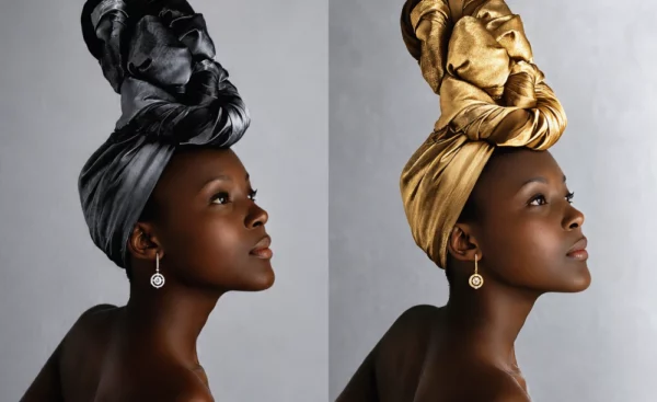
CECIE, 22: STUDENT
Rich Skin Tone
Cecie is one of our favourite fashion magazine muses, and we love it when she models for us!…
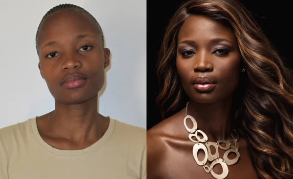
TANDI, 31: ADMIN CONTROLLER
Rich Skin Tone
With her flawless complexion, beautifully shaped lips and natural elegance, Tandi has undeniable movie-star potential. For her makeover,…

LUCIA, 25: AUDITOR
Rich Skin Tone
Lucia had never won anything in her life, so you can just imagine her pure delight when she…

RUTH, 34: EXECUTIVE SECRETARY
Rich Skin Tone
Ruth's hair was first relaxed to make the hair soft and manageable. Remember, if you have a round…

GRANNY, 30: BUS ASSISTANT
Rich Skin Tone
Granny is a 30-year- old bus assistant for Translux; she travels throughout the country meeting with customers. Granny…

LULEKA, 28: HUMAN RESOURCES
Rich Skin Tone
We trimmed Luleka's wig into a modern, yet classic style. She didn't need a lot of makeup, and…

NOMCEBO, 21: STUDENT
Rich Skin Tone
We wanted to give Nomcebo, a 21-year old second year student, a fresh new look that would lay…

NONTHLE, 37: BEAUTICIAN
Rich Skin Tone
Nonthle, a beautician, wanted a stylish look to suit her profession. With a classic bob and heavy angular…

MERRIAM, 25: ACCOUNTANT
Rich Skin Tone
Merriam held a senior position that demanded confidence and credibility. The challenge was that everyone thought she looked…
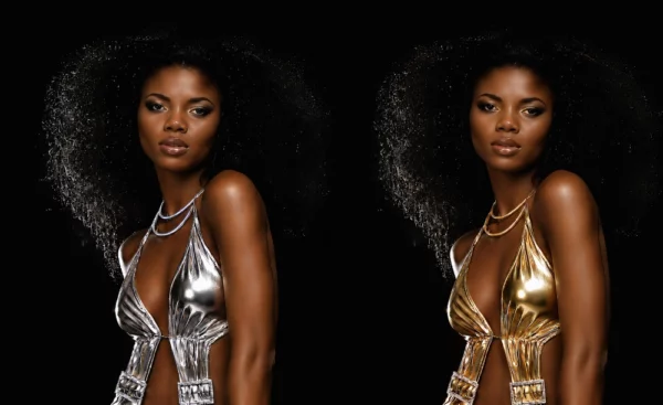
ROSE, 23: INTERN FOR UNITED NATIONS
Rich Skin Tone
Metallics are a timeless fashion statement, but the right shade makes all the difference. Rich skin tones have…

SAMKELISIWE, 22: STUDENT
Rich Skin Tone
Samkelisiwe was a lucky competition winner, and part of her overall prize was a complete top-to-toe makeover! Our…
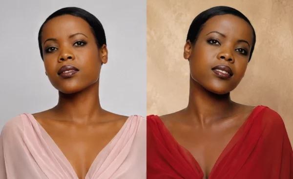
CECIE, 23: STUDENT
Rich Skin Tone
The difference is remarkable. In the before photograph, the pale pink drains Cecie's natural colouring, making her complexion…
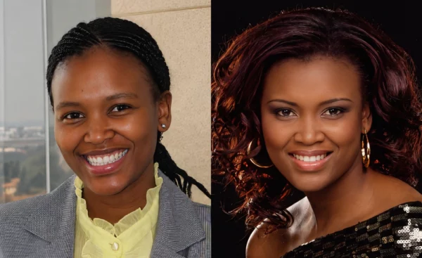
ANDY, 28: ACADEMY MANAGER
Rich Skin Tone
Andy is so naturally beautiful – from the inside and out – she just takes your breath away.…